Front-end 계층 구조별 주요 실습 도구
HTML = 배치 구조
| 계층 | 역할 | 주요 실습 도구 |
|---|---|---|
| 렌더링/테스트 | 코드 변경을 실시간 확인 | Live Server, Chrome DevTools |
| HTML (DOM 구조) | 콘텐츠의 뼈대 구성 | <section>, <div>, <h1> 등 |
| CSS (스타일링) | 레이아웃과 색상, 폰트, 여백 등 시각 표현 | DevTools 수정, Tailwind, CSS 파일 |
| JavaScript (동작 제어) | 버튼 클릭, 탭 전환 등 상호작용 | JS 또는 jQuery, Vue, React 등 |
| 통신 (API 연동) | 백엔드 데이터 호출 및 처리 | fetch, axios 등 REST API |
DOM (Document Object Model) 트리 구조 예시: SaaS App Marketing Landing Page
plain text
<body>
  ├── main
  │   ├── section.hero.grid-2-cols
  │   │   ├── hero.left
  │   │   │   ├── title
  │   │   │   ├── paragraph
  │   │   │   └── buttons (login, app store × 2)
  │   │   └── hero.right
  │   │       └── video (mp4 usage demo)
  │
  │   ├── section.features.tabs
  │   │   ├── tabs.left (menu)
  │   │   └── tabs.right (tab-content image)
  │   │       ├── title
  │   │       └── paragraph
  │
  │   ├── section.testimonials
  │   │   └── testimonial.card × N
  │
  │   ├── section.pricing
  │   │   └── pricing.card × 3 (Free, Pro, Enterprise 등)
  │
  │   ├── section.faq
  │   │   └── accordion.item × N
  │
  └── footer
      └── links + legal.notice
Tailwind CSS 예시: Hero Section
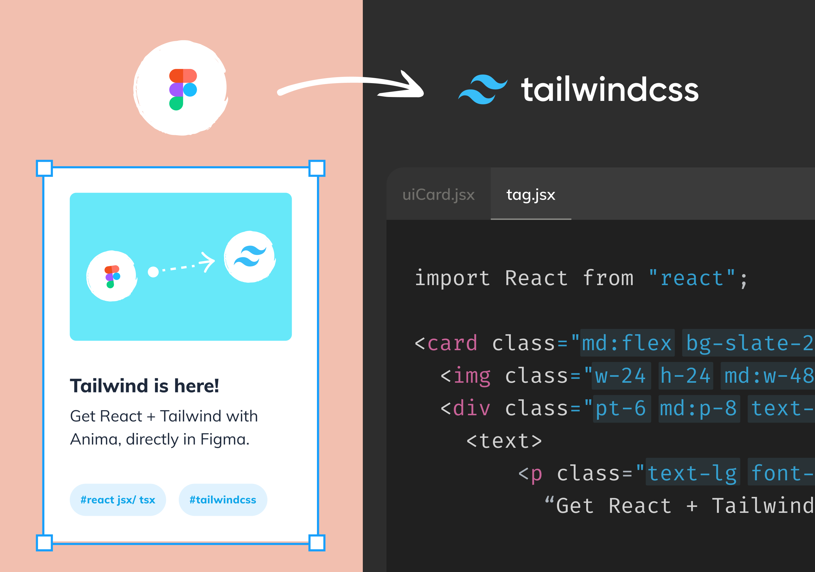
Tailwind CSS는 디자이너와 개발자 모두에게 친화적인 유틸리티 CSS 프레임워크입니다. 직접 CSS를 작성하지 않고도 bg-blue-600, text-white, rounded-lg와 같은 조합형 클래스로 빠르게 디자인이 가능합니다.
- Tailwind CSS는 Local 설치 없이 아래 한 줄로 사용 가능 (무료 CDN 이용)
- 화면 크기 반응형 디자인(responsive)도 클래스 조합으로 처리
html
<!DOCTYPE html>
<html>

<head>
  <meta charset="UTF-8">
  <script src="https://cdn.tailwindcss.com"></script>
</head>

<body>

<section class="grid grid-cols-2 gap-8 p-8 items-center">
  <div>
    <h1 class="text-4xl font-bold mb-4">Your App Title</h1>
    <p class="text-lg text-gray-600 mb-6">One sentence explanation</p>
    <div class="space-x-4">
      <button class="bg-blue-600 text-white px-4 py-2 rounded">Login</button>
      <button class="bg-black text-white px-4 py-2 rounded">App Store</button>
      <button class="bg-green-600 text-white px-4 py-2 rounded">Play Store</button>
    </div>
  </div>
  <div>
    <video src="appdemo.mp4" autoplay loop muted class="rounded-xl shadow-lg w-full"></video>
  </div>
</section>

</body>
</html>